![]()
Step-by-Step Guide to Branding and Logo Design
BRAND: A customer’s gut feeling about a product, service, or company.
Marty Neumeier
It is undoubtedly not easy an easy task to build a brand; you have to juggle around many things. Which kind of brand should you create? How will it affect people? Would your target audience connect with it? Nevertheless, you will successfully develop a killer brand with dedication and effort.
In essence, branding is primarily about connecting your product to the people you wish to reach.
A robust branding acts as a driving force for your business. Even if you already have established your brand, rebranding every six to eight months will let your audience know that your business is growing and you are still relevant.
But, what are the steps you should take if you’re just starting your business and want to build the brand from scratch?
It all comes down to investing much time, effort, and in-depth understanding of how your business works and maybe enlisting the assistance of a marketing team.
In this article, we will discuss how to design a logo for your business and establish a strong brand.
Table of Contents
What is a brand, anyway?
A brand distinguishes your business from the other businesses in the market, no matter how similar they are to what you do. It is how people perceive a product, company, or individual.
Our impression of different people varies based on differentiative qualities — face, dressing style, way of speaking, dressing, and communication.
Similarly, your business has differentiative qualities such as names, products, logos, colours, fonts, and a voice that makes it stand out in front of your target audience.
Building your brand is about consistency and the feeling you want to evoke among your prospects when they hear about your brand.
Building a Brand
Let us walk you through the seven essential points for creating a killer brand and its identity in the market.
Identifying your target audience and your competitors
Targeting everyone would not be an ideal strategy for you. While it allows you to reach a wider audience, it is still more of a futility exercise. Identifying your target demographics should be the first and foremost thing on your to-do list.
Target demographics is a market segmentation based on family size, religion, gender, age, ethnicity, income, and education. By segmenting the data into different markets, companies can precisely target customers.
You can follow standard practices to find out more about your target audience and competitors:
- Google your product or services to see who all are providing the same services or products as you. It will help you figure out your competitors.
- Take a look at subreddits related to your customers and observe their conversations.
- Have a conversation with the target audience to know which brands they buy from in your market.
- Examine your target audience’s social media accounts and pages to see what captures their interest.
- Shop online and offline to see how your customers browse and purchase products.
By doing so, you can figure out:
- The people whom you can easily target and sell your products to
- Who are your top competitors
- How do your customers speak, and what are their interests
You can use this to figure out what set of audience your brand should focus on and how you can make your business stand out from others.
The positioning statement
By creating a positioning statement, you propose how the market should perceive your brand. It helps you formulate your brand’s tagline and correctly answer the questions about your brand.
You will have to define what differentiates your business from others. Think of it as a description of unique benefits that your competitors do not provide.
The unique benefits can include lower pricing, offers, discounts, free services, interactive user interface, etcetera.
Suppose, if your competitors are too old, traditional, and conservative, you can do the opposite of that. You must build a brand that resonates with the younger generation and is cutting-edge.
Defining your brand’s voice and tone
Figure out what kind of brand personalities your customers are attracted to. It will help you find the type of voice you should use on social media channels and the tone of any other content you create for your customers.
Metaphors can also be part of your brand identity, as long as they evoke the sort of vibe you want from your brand.
Creating a Slogan
When creating a slogan, keep in mind that you only have a few words to impact your customers, and it should be short, crisp, and catchy to boost your brand impression. You can use a catchy slogan as a tagline for social media bios, website headers, custom business cards, etcetera.
As your business grows, you can change your slogans when you develop a new vision and marketing strategy down the lane.
Here are examples of some slogans you can refer to get an idea of what your slogan should look like.
Choosing colours and fonts
The next step is to work on your brand design – how would you visually present it? Definitely, you want to use typography that looks professional and attractive to the customers. The simpler the font, the more attractive and neat it appears to customers. The font type you choose will also determine how your website content will look.
Apart from enhancing your brand, colours also convey a feeling to your customers or prospects. Colours can also help your customers distinguish your brand from your competitors when they get confused. Each colour has its own meaning and significance; you can utilise colour psychology to determine the best colour combination for your prospects.
Design your brand logo
Consider your brand logo as the face and the identity of your business. Your logo is everywhere your brand exists — a website, business cards, socials, ads, invoices, etcetera.
A good logo should have a design that conveys the owner’s intended message in a distinctive, appropriate, practical, graphic, and simple way.
Here are a few things to keep in mind when designing a logo.
Seek inspiration for your designs
- Conduct one-on-one brainstorming sessions or include everyone in your team and write the best ideas down you get during the session. If a conversation starts with a lame idea, keep the session going. You might collect a few great ideas or that one genius idea by the end of the session.
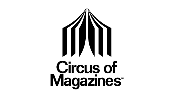
- Don’t be afraid to experiment with the logo and think outside the box. Consider Circus of Magazines as an example of cleverly combining ideas. They have an open magazine shaped like a circus tent that appears interactive and interesting. At the same time, it also conveys the brand’s literal meaning.
- Sketch all the ideas you found interesting after your brainstorming session. Don’t get discouraged if your first few sketches aren’t quite right. Refine your new sketches using the previous illustrations.
- Keep the shape simple while sketching. Also, avoid using generic symbols such as globe, star, etcetera that companies are using excessively.
Check out your competitors
- One of the most important highlights is to figure out how your competitors have created their logos. Look out for what’s already out there, how the audience is engaging with it and the things you should avoid implementing.
- When looking at your competitors’ logos, realise what differentiates you from them and think about how you can highlight them in the logo design.
- Include colour in your logo design; be selective about what colour you choose. Be aware of what trendy colours are in use nowadays and what will fit perfectly in your target market.
- Don’t choose a similar colour as your competitor. Remember, the goal is not to hide in the herd of your competitors; your business needs to stand out. For example, if your industry’s norm is monochrome, you should use some colours to be distinct.
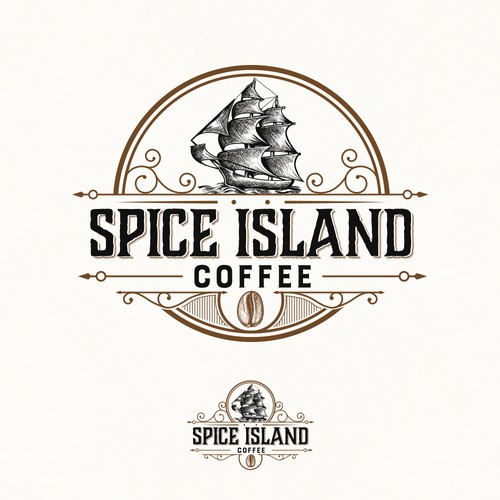
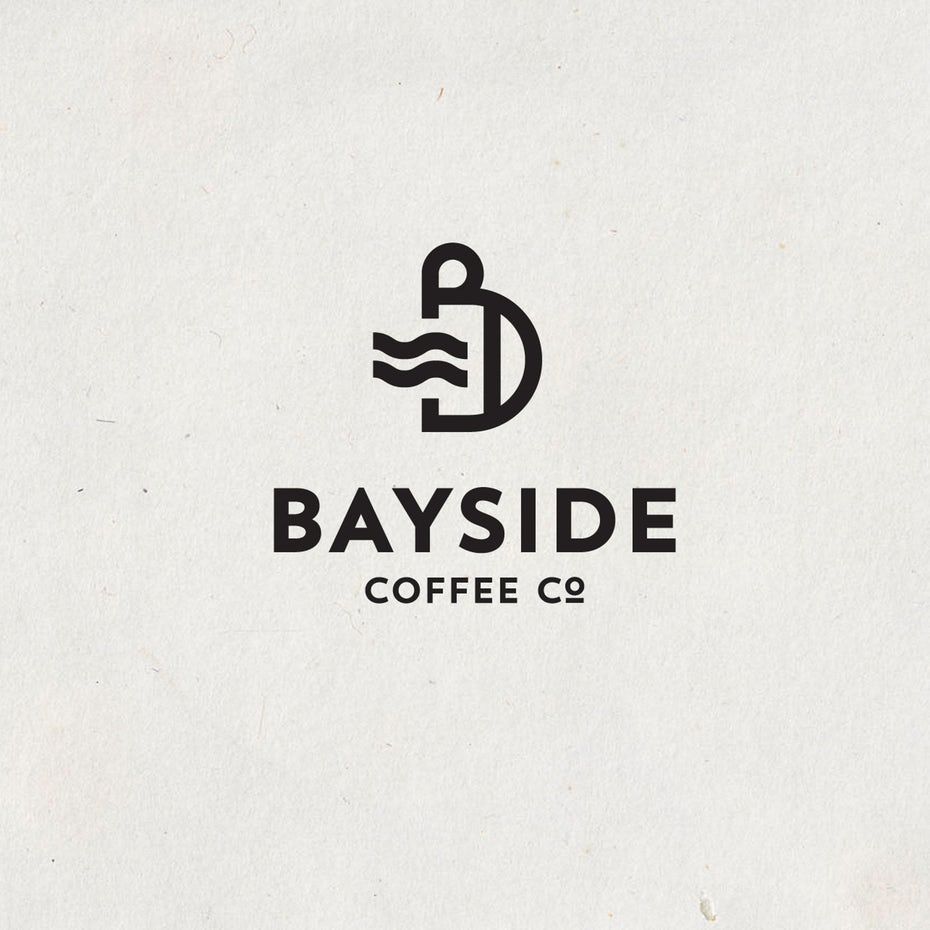
Take a look at the logos of the three coffee companies above. In contrast, the BAYSIDE logo seems modern and cool, while the Spice Island coffee logo has a vintage feel, portraying that it has been in the market for a longer period and is reliable.
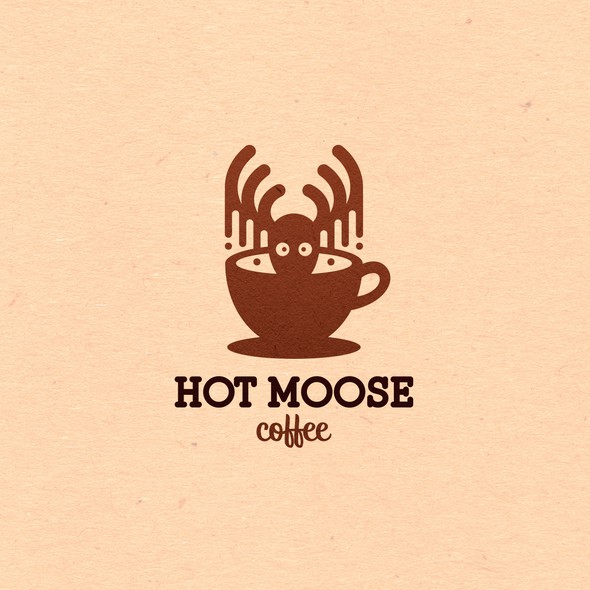
The whimsical illustration of Hot Moose can be an inspiration if you want your design to be fun and pleasant.
Decide on your design style
- The elements that set your logo alive are colours, shapes, graphics, and typography. Take things easy and step by step rather than focusing on the whole design.
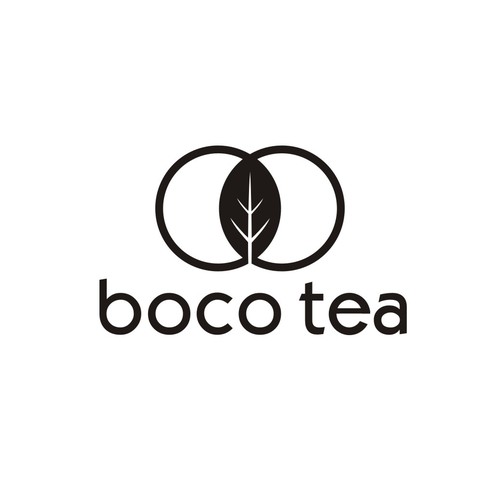
- The first thing is to select the right aesthetic for your brand. Will it be classic, vintage, modern, fun and quirky, or an illustration?
Classic Logos
The classic logos are less likely to be outdated. This aesthetic keeps the logo simple and avoids the use of crazy colour palettes, graphics or fonts. Classic styles give people the impression that your brand is trustworthy and dependable.
Here are some examples of classic designs you can take inspiration from.
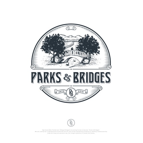
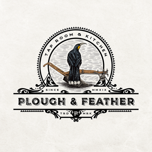
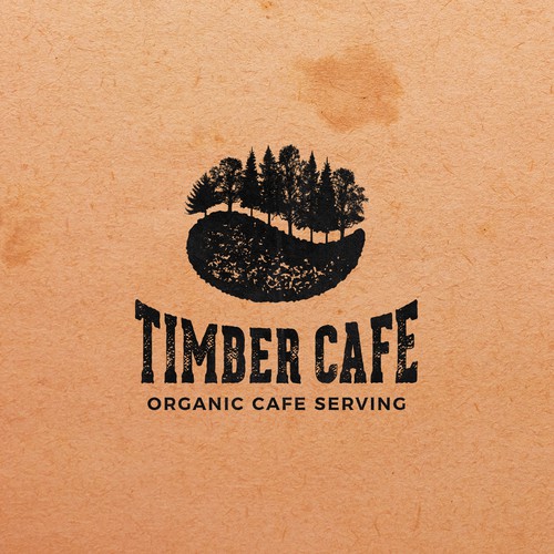
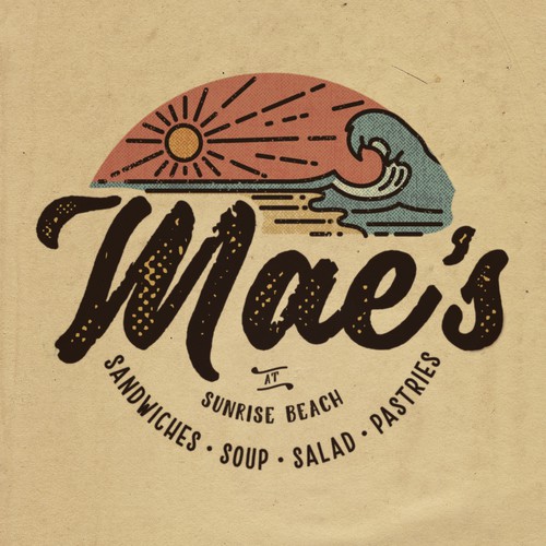
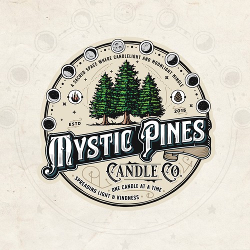
Vintage Logos
The vintage aesthetic beauty instantly brings up memories of the past and elicits feelings of nostalgia. Vintage logos tell customers that you value history and do things right. Hand illustrated logos with a weathered appearance in brown and beige colours fit this aesthetic perfectly.
Here are some of the vintage logo designs to take inspiration from.

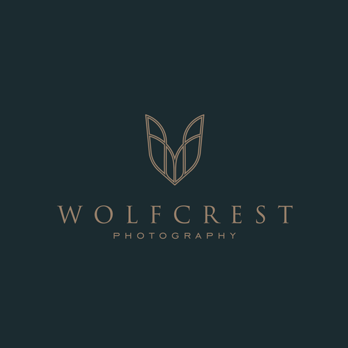
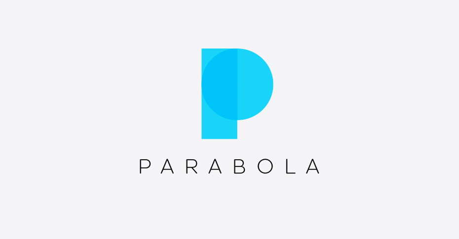
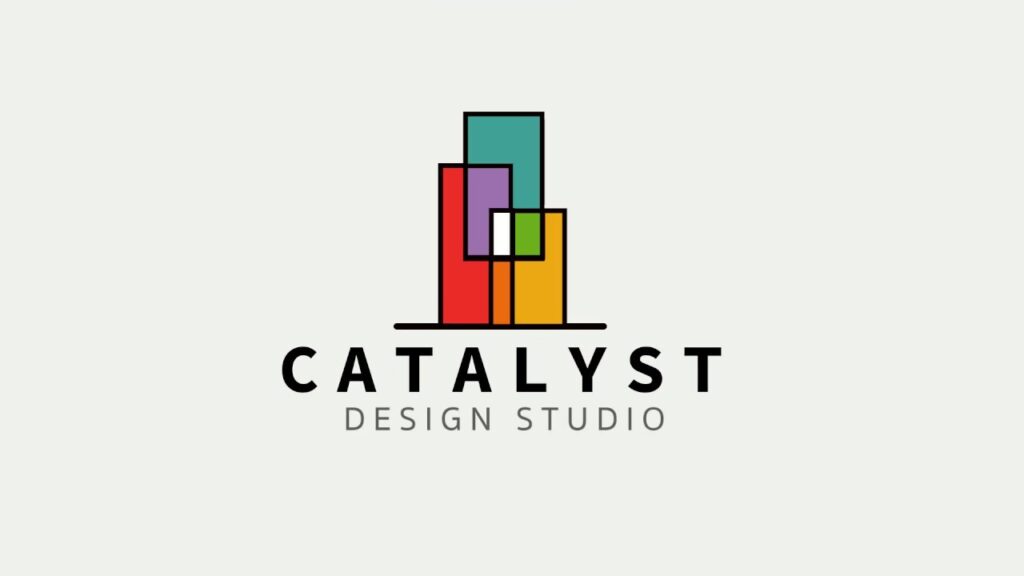
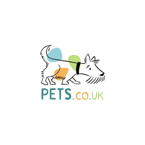
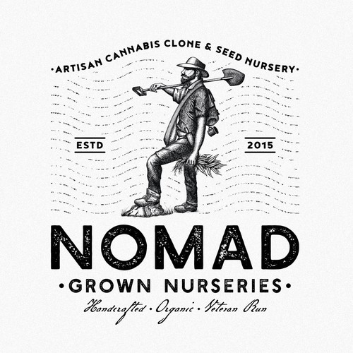
Modern Logos
Brands often choose clean and modest styles to communicate how fresh and contemporary they are. This aesthetic uses simple shapes, whitespace, and the tiniest details, often resulting in a sleek logo that will make your brand appear up-to-date.
Here are some examples of modern logos.
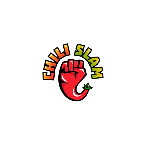
Fun and Quirky Logos
This aesthetic fits the business whose prime target audience is youngsters. It uses illustrations that give out a friendly vibe. The main aim of this aesthetic is to bring out the fun character of your business.
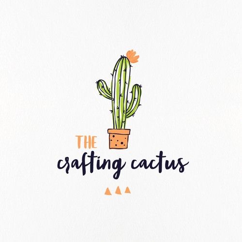
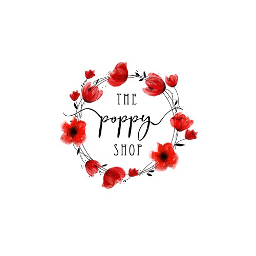
Handmade Logos
Brands with handmade logos convey that their quality is handcrafted. This aesthetic gives out a sophisticated and bright or youthful look.
You don’t have to choose one of them and get started with the logo. There is always an option of mixing and matching. Go ahead and experiment with all the aesthetics mentioned above. Who knows, maybe you can come up with a logo that is one of its kind.
Here are some examples of Handmade logos.
Selecting a colour
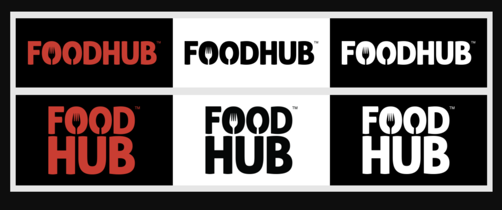
Different colours work together in logo colour to make your brand memorable. Even if your logo’s colour scheme looks wonderful against the canvas you designed it on, you need to think of how it would look on the background you will place it on at the end.
Create Silhouettes of your logo to ensure that it has colour variations on light and dark backgrounds. You might only have to change the colour of your font, and If necessary, you may have to change your entire logo’s colour.
While selecting a colour, remember that you have to be creative with colours to help clients with low vision.
- Colours that reflect the most light, such as red, yellow, etcetera, are the easiest to see.
- Bright objects contrast nicely with dark backgrounds.
- Dark objects pop against light backgrounds.
Refer to the FOOD HUB logo silhouettes below:
Colour Theory
The colour theory is the study of the fundamental principles that govern the use of colour in creating visuals that are pleasing to the eye.
Colour theory basics can help you learn the logical structure of colour to create and use colour palettes more effectively.
Learning the basics of the primary, secondary and tertiary colours is all you need to understand about the colours.
The primary colours
The primary colours are the parent colours of the colour palette. You can’t create primary colours by combining two or more colours, and these primary colours are:
- Red
- Yellow
- Blue
Although you can form different colours by combining these primary colours. For example, Yellow + blue = Green. Similarly, you can play around with these colours and explore other shades, tones, and tints.
Secondary colours
The formation of secondary colours occurs by combining any of the two or three primary colours. For example:
- Red + Yellow = Orange
- Blue + Yellow = Green
- Blue + Red = Purple
These combinations only work when you use the colour’s hue, which is the purest form of the primary colours.
Tertiary Colours
The formation of tertiary colours occurs by combining secondary colours with primary colours. Creating the tertiary colours can get complicated as not every secondary and primary colour matches to give out the right shade.
For example, you can’t mix red and green as this mixture will just create a slightly brown colour.
Some of the tertiary that fit the requirements are:
- Red + Purple = Magenta
- Blue + Purple = Violet
- Blue + Green = Teal
- Yellow + Orange = Amber
- Red + Orange = Vermillion
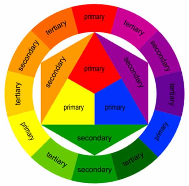
The Colour theory Wheel
Now, you know all the significant colours; now we will move on to choosing colour combinations on your working system — Computer, Tablet, laptop, etcetera.
There are many more colours in your working system than the 12 basic colours. Thus, the colour wheel shows each of the primary, secondary, and tertiary colours in the circle graph and their hues, tints, tones, and shades.
By visualising the colours in this manner, you can easily understand how each colour relates to its neighbour on a rainbow colour scale — red, orange, yellow, green, blue, indigo, and violet.
These colour wheels allow you to create brighter, lighter, softer, and darker colours by mixing white, grey, and black with the original colours.

Hues
All primary and secondary colours are hues. It is imperative to keep the hues in mind; If you don’t use the hues of the two primary colours you‘re mixing, you will not be able to create the hues of the secondary colours.
Mixing red and blue, for instance, would yield purple, wouldn’t it? But if you mix a reddish tint with a blue hue, you will get a slightly tinted purple as a result.
By combining two primary colours containing tint, tone or other shades, you technically add more than two colours to the mixture, making your final colour dependent on more than two colours.
Shade
A shade is a dark version of hues. You get this colour when you add black to the hue, and the amount of black you add determines how dark the shade becomes.
Tint
The tint is the opposite of the shade; it is the light version of hues. You get this colour when you add white to the hues.
Tone or Saturation
A tone formation occurs by mixing hues with black and white colour simultaneously. If a designer uses colours for the digital image, they mostly use saturation, whereas this term is known as tone in painting.
Additive and Subtractive colour model
It has two colour models — CMYK and RGB.
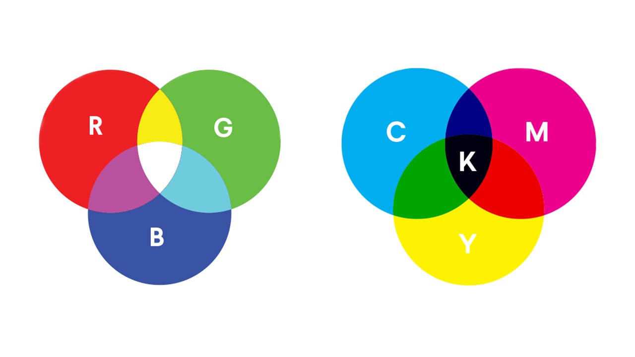
CMYK
CMYK stand for CYAN, Magenta, Yellow, and Key (Black). CMYK is a subtractive colour model because you will have to subtract the colours to get to the white. Also, the more colours you add, the closer you get to the black.
CMYK works on a scale of 0 to 100. For example, C = 100, M = 100, Y = 100, and K =100, you will get black colour, and if C = 0, M = 0, Y = 0, and K = 0, you will get white colour.
RGB
Electronic displays use the RGB model, including computers, tablets, etcetera.
The RGB model states that the more colours you add together, the closer you get to the white colour.
For computers, RGB is created using scales from o to 255. For example, Black would be R = 0, G = 0, and B = 0, and white would be R = 255, G = 255, and B = 255.
The Meaning of Color
Red — symbolises power, passion, or energy
Orange — symbolises joy and enthusiasm
Yellow — happiness and intellect
Green — symbolises growth or ambition
Blue — tranquillity and confidence, lighter shades symbolise peace, darker colours symbolise confidence
Purple — luxury or creativity
Black — power and mystery
White — safety and innocence
The Colour Schemes
There is a total of six colour schemes.
Monochromatic
Monochrome uses a single colour with various shades and tints to create a consistent feel and look clean and polished.
You can use monochromes in the graphs and charts.
Analogous
The formation of an analogous colour scheme occurs by combining the two colours directly adjacent to one another on the colour wheel.
You can use analogous structures to create less contrasting and softer themes. It s used to design images rather than infographics.
Complementary
A complementary colour scheme uses two colours across from each other on the colour wheel and related tints of those colours.
These are high contrast colours that help you highlight the important points.
Triad
A triadic colour scheme involves choosing three equally spread colours around the colour wheel.
Using triadic colours provides good contrast for graphics like bars or pie charts, making comparisons easier.
Split-complementary
The split complementary scheme features one dominant colour and the two colours immediately adjacent to the dominant colour’s complement.
It can be tricky to find the right balance between two colours in split-complementary. You’ll have to play around with colours more to figure out the proper contrast.
Tetradic
A tetradic colour scheme is a rectangle approach where you use four colours adjacently equidistant from each other.
Tetradic colour schemes help the border to stand out.
:max_bytes(150000):strip_icc():format(webp)/easy-color-schemes-from-color-wheel-797784_V4-51db985b605c49e29ee1f6186d6ec258.png)
Here are some of the websites you can use to generate a perfect colour scheme.
Brand name as a logo; pros and cons
Using a company’s name instead of a logo as a FAVICON (a small icon that replaces a logo in various placeholders) makes it harder for visitors to identify your account.
On the contrary, a brand name as a logo means:
- Reinforces the brand name
- Repetition and retention of the branding
- Using brand name as the keyword
Using a brand as a logo can prove beneficial for you. If you use a brand name as a logo, multiple audiences will come across it. Upon reading your brand name out of curiosity, they might search for your brand and be interested in your products or services.
It is possible for you to gain a potential customer. This is the strategy used by several brands, such as Adidas, which has used their brand name with the respective logos on their different products.
Choosing a font
After selecting the colour, now it is time to merge your text and the imagery. Choose the simple, classic, and modern font for the audience — serif or sans serif.
We suggest you stay away from generic fonts like Times New Roman, Comic Sans, and Lucida Handwriting.
Ensure Logo scalability
Let’s say you’re a company selling washing machines, and you then incorporate that product into your logo. That’s a great idea. However, what if you decided to start selling washing machines and refrigerators in the future?
Create a logo with such an ideology that it will remain scalable regardless of how many products you add to your business in the future.
Furthermore, You will display your logo anywhere and everywhere – on the website, billboard ads, social media, etcetera. It is ideal to make your logo large enough for billboards and scale it down when used on your website, social media, or merchandise.
Irrespective of the size, people should be able to see every single detail of your logo.
Ensure that every part of the logo is clearly visible regardless of its size.
Your brand isn’t what you say it is. It’s what they say it is.
Marty Neumeier
Using the brand strategy across your business
With an effective logo, you can incorporate branding into all aspects of your business. It is all about creating a brand story that conveys the significance of your business and what it represents.
Branding is also the foundation of how your customers interact with your brand.
How to build a brand story? You’ll want to ask yourself a few questions to get started:
- What made me decide to start my own company?
- What drives the company’s existence?
- How do we contribute to society?
- Why should my customers care about my business?
Takeaways
Building a brand doesn’t stop with creating a logo or slogan, and your brand needs to radiate a consistent feeling wherever your customers interact with it.
You’ll continue to shape and evolve your brand design and identity as you expose more customers to it and learn more about your customers and how to interact with them.
So, make every effort to connect with your core audience and ensure you have the necessary knowledge and resources to begin your journey.